
Colour in the office isn’t always a priority for owners of commercial buildings or office blocks. This is often why you’ll see offices coated in simple, classic white paint. While there’s nothing wrong with this, as white can give a clean and timeless feel, there are some benefits to choosing a different colour to adorn your walls, or to use as an accent to your existing decor. In this article, we’ll be taking you through the advantages of choosing a colour for use in your office. Using colour psychology and drawing on studies associated with it, here’s why colour is important in the workplace, together with some colour suggestions for your own office:
Why does colour in the office matter?
While many office owners will opt for the classic white-wash walls, which are cheap to maintain and will go with anything and everything, there’s evidence to suggest that adding a bit of colour to the workplace is one of the best things you can do for your workforce. According to Very Well Mind, colour can play an imperative role in a wealth of different things, including:
- Conveying information
- Creating certain moods
- Influencing the decisions people make
People will often select colours that evoke different moods and feelings, claims the same source. This is all down to something called ‘colour psychology’. It’s the art of exploring how different colours can influence different feelings and emotions in humans. There was some research done into colours and the emotions they evoke. That research showed that:
- Red symbolises passion, excitement and love
- Pink symbolises softness, reservedness and earthiness
- Purple symbolises mystery, nobility and glamour
- Blue symbolises wisdom, reason, hope and peace
- Green symbolises nature, growth and freshness
- Yellow symbolises hope, joy and danger
- Orange symbolises warmth, kindness and joy
- White symbolises truth and indifference
- Black symbolises nobility and mystery
What do people really think about colour?
With the aforementioned information in mind, it’s clearly never been more important, according to the same research, to add some colour to your workspace. But the research doesn’t stop there. A further study was conducted in 2020. It involved 4,598 people from around the world. They were asked to convey what emotions certain colours evoked in them. The study found that:
- 43% of people said that white evoked feelings of relief, with 35% of people saying that blue evoked the same emotion
- 68% associated red with love
- 39% of those asked said that green aroused feelings of contentment
- 52% of people associated yellow with feelings of joy, along with 44% of people who said that orange evoked the same feeling
- 25% felt that purple was associated with pleasure
- 50% of participants associated pink with love
- 51% of those asked said that black made them think of sadness
- 36% of people said that brown was linked with disgust
Not all of those associated feelings and emotions are positive. But it gives you an idea of which colours to choose for your workspace and which ones to avoid. For instance, you should refrain from using black or brown in the office. This is because the emotions and feelings they arouse are negative. However, colours like yellow, green and orange, among others, are more than suitable for use throughout the workplace. This is the case regardless of whether you paint an entire wall that shade or use that colour as an accent.
Some of the best colours to use in the office
Now that we understand more about colour in the workplace, and why it’s so important, we have collated a list of different colours that can be used in the office, each one with its own benefits to offer. From blue and orange to red and yellow, here are the colours available that will aid in productivity, motivation and concentration:
Blue
Blue is often chosen for its ability to support focus and clear thinking. It’s ideal for placement in spaces where concentration, focus and clear thinking are needed. This, therefore, aids in the art of problem solving. This is often why blue is the colour of choice for private work booths, where focus and concentration are paramount.
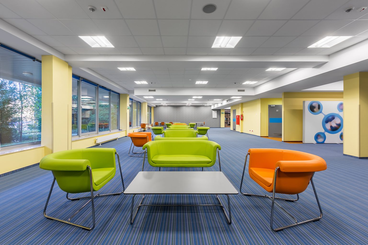
Green
Green, like many colours, comes in a variety of shades. On the whole, it’s linked with balance and calm. This is why it’s often a colour used in breakout areas and communal kitchen areas. It also works well in workspaces where long hours are spent getting the job done. It can also improve concentration levels whilst evoking thoughts of nature, which can be a peaceful presence. It’s designed to ignite creativity and motivation whilst encouraging broader thinking and revival.
Yellow
Yellow is associated with energy and creativity, making it a popular colour choice for collaborative areas or even for design studios. It is also commonly associated with happiness and sunshine, making for an always-bright and sunny environment that will aid in boosting morale and productivity in the workplace. In turn, this aids in effective teamwork whilst also giving off relaxing vibes that can be enjoyed while workers are on their lunch breaks or just enjoying some downtime before getting back on the job.
Red
Red can increase alertness in the workplace, but it should be used in moderation as large amounts of it can be somewhat overwhelming. It does, however, provide a warm feel whilst also being energising and motivational. Instead of covering entire walls with red, use it as more of an accent colour or for zoning off specific areas. This can be just as effective as colouring entire walls in one block colour. Red is also a good colour for benching stations or team booths.
Neutrals
Neutral tones can include shades like beige, whites and soft greys. Neutral shades have been proven to reduce visual clutter, making other elements of the office stand out, such as furniture, artwork, kitchen cupboards and suspended ceilings. These tones also provide a timeless foundation for the rest of the office, meaning that you won’t have to worry about colours coming in and out of fashion. Simply refresh your existing wall colour as and when it needs an update. This will save you time and money in the long run as well as ensure a professional backdrop for any workspace, whether it be an office or another commercial setting.
Grey
Grey is a nice compromise between black and white, with the same effect given. It can be used as a blank canvas or backdrop for things like artwork and kitchen cabinets in a communal space, or it can be left on its own, fostering its own personality, look and feel. It adds a hint of sophistication whilst not being too out there. Grey also highlights intellect and is linked with modernity and technological advancement, making it the ultimate choice for a professional setting, such as an office.
Orange
Orange, a warm colour that’s on a similar spectrum to red and yellow, can be used to complement cooler tones and hues This makes orange a great colour for areas where in-depth presentations are being held, especially where screens are used, whether on a computer or a larger screen used during conferences and large meetings.
C
C
At FIT Interiors, we specialise in delivering expert office fit-out and refurbishment services throughout Nottingham. Our work covers everything from installing washrooms and breakout areas to suspended ceilings, office flooring and more. If you’re interested in learning about our fit-out or refurbishment options in Nottingham, feel free to reach out to our friendly, knowledgeable team – we’re always happy to assist.